Infographic 1, The Unforgettable Pancake
Delivering and Evaluating WHS Training in Australia
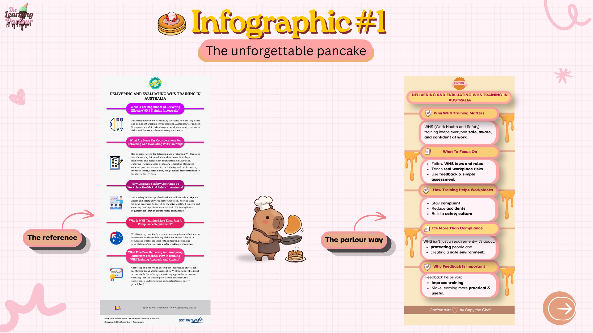
Most infographics try to say everything at once. They cram in walls of text, compete for attention, and leave the reader scrolling past without absorbing a single thing.

I rebuilt a dense reference into a stack of bite-sized pancakes, clear headings, short answers, friendly visuals, so the WHS message actually lands and sticks.
Blueprint Process
Idea
Pin down the subject, the audience, and the one job this infographic has to do before opening a single design tool.
Inspo
Gather 5-10 references that already do this well. Save what works, screenshot what doesn't, build a mood of the vibe you're chasing.
Decode
Pull the references apart. Why does this hierarchy work? Which colour is doing the heavy lifting? What's the unspoken grid? Steal the principles, not the pixels.
Build
Now design it the parlour way, apply the decoded principles, run it through contrast, hierarchy, proximity, alignment, repetition, white space. Then ship.
The finished pancake 🥞